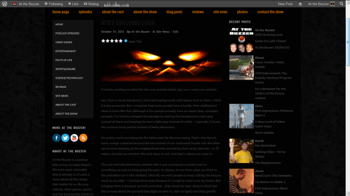
I’ve been working to make the site even prettier lately, but now I need your opinion.
See, from a visual standpoint, I love dark backgrounds with lighter text on them. I think it looks awesome. But I recognize that some people have a harder time reading text when it looks like that (although a few people actually have an easier time, strangely enough). I’ve tried to mitigate the damage by making the background a dark gray instead of black and keeping the text a light gray instead of white — basically, it keeps the contrast more gentle instead of being obnoxious.
I’m pretty much just doing this for Halloween for the time being. That’s why there’s some orange scattered around the site instead of our trademark buzzer red. But after you’re done beating up the neighborhood kids and taking their candy (aka Nov. 1), I’ll make a decision on whether this look stays or not. And that’s where you come in.
This poll will help determine whether this is just a temporary holiday look or something we look to keep going forward. So please, let me know what you think in the poll below (or in the sidebar). After all, we want people to keep visiting the blog as much as possible — turning them away because it’s tough to read is not my intent. But bringing more in because we look awesome…that would be neat. Keep in mind that this is more about the general idea (light on dark vs. dark on light) and that specific things like how much dark/light there is can still be tweaked later. Also, you can comment below if you have more to say.
This is the most important vote you’ll face in the next month; make it count!
NOTE: Okay, so results are mixed. Can’t say I’m surprised. I’m going to switch back to the old look for now and post this below so you can compare and contrast. I still have to work on ways to make that gray text lighter, as mentioned below.


Literally couldn’t read it without highlighting the text, lol.
I really like the dark look, it’s very sleek and modern. However, on my computer, the gray body text is still pretty dark. The lighter gray text of your menu and headers is much more readable in contrast. Also, the links on your home page under the slide show are nearly the same color as the screen, until you scroll over them (a sneaky tactic, hmm?). All of this could just be because of my own visual settings, or my old eyes.
Hmm. I do like the way the menus and headers pop. Maybe the compromise will be having just that left-hand column be light and dark, while the main body part of the site is dark on light.
The text definitely needs to be lighter. The “light grey” text actually shows up pretty dark on my monitor. Right now, I have to highlight it to read it easily.
Yeah, I had the same problem with it. It even looked a little different between Firefox and IE. Unfortunately, fixing that will require dipping into custom CSS, which I’m still figuring out. Gonna have to keep playing with it.
The ATB mobile site is awesome this way! It also hasn’t changed. Will vote at home.
That’s interesting. Maybe it can’t support backgrounds or something. Weird.